1. The first question: what exactly is being measured?
0:007:09
Math

How to Spot Misleading Statistics

Charts lie, averages deceive, and headlines cherry-pick. Learn to see through the numbers that shape public opinion.

Apr 22, 20267 min listen5 chapters
What you'll learn
  • How to spot misleading charts and statistics
  • Base rates, selection bias, and survivorship bias
  • Reading scientific studies without a PhD
  • Making better personal decisions with data

1. The first question: what exactly is being measured?

note

How to Spot Misleading Statistics

Charts lie, averages deceive, and headlines cherry-pick. Learn to see through the numbers that shape public opinion.

note

What a statistic leaves out

A statistic can be true and still mislead if it hides the denominator, the time frame, or the comparison group.

Three questions to ask first

What was counted?

Out of how many?

Compared with which baseline?

Example

A report that says “hospitalizations rose 30%” means something very different if the count went from 10 to 13 than if it went from 1,000 to 1,300.

diagram
note

Raw counts versus rates

Raw counts answer “how many.” Rates answer “how common.”

If one county has 2 deaths and another has 20 deaths, the second sounds worse. But if the first county has 1,000 people and the second has 200,000 people, the rate is 200 per 100,000 in the small county and 10 per 100,000 in the large county.

That is why public health often uses rates per 100,000 people, and why sports stats use per-game averages.

chart · bar
Same count, different rate
County A deathsCounty B deathsCounty A population in thousandsCounty B population in thousands

2. Charts can distort without changing a single data point

note

Common chart tricks

Truncated y-axes can exaggerate small differences.

Dual-axis charts can make unrelated trends look connected.

3D effects can hide the true size of bars or slices.

The rule of thumb

If the chart is making a strong claim, inspect the axis first.

diagram
illustration
A misleading bar chart with a truncated y axis making a small difference look large, with the axis labels clearly visible
note

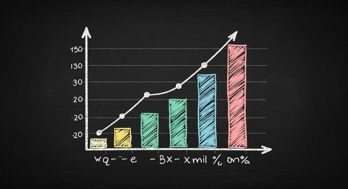
Why zero matters for bars

Bar charts encode quantity by length. Length is only easy to compare when the baseline is fixed.

If the baseline is not zero, the visual exaggerates. A 4-unit increase from 98 to 102 looks huge if the bars start at 90, but the true change is about 4.1%.

Line charts are different. For trends over time, a nonzero baseline can be acceptable if it is clearly labeled. The problem is not every cropped axis. The problem is hidden cropping.

3. Averages can hide the real story

note

Mean, median, mode

Mean: sum of values divided by number of values.

Median: the middle value after sorting.

Mode: the most frequent value.

When the median is better

Use the median when the data are skewed or when outliers are extreme.

Use the mean when every value should count proportionally, such as in total cost calculations.

equation
Mean=x1+x2++xnn\text{Mean} = \frac{x_1 + x_2 + \cdots + x_n}{n}
diagram
chart · scatter
One outlier changes the mean

4. Correlation is not causation, and base rates matter

note

Correlation versus causation

Correlation says two variables move together.

Causation says one variable changes the other.

A third factor can cause both, or the relationship can run in the opposite direction.

Base rate

The base rate is the underlying frequency of a condition in the population.

equation
Positive predictive value=true positivestrue positives+false positives\text{Positive predictive value} = \frac{\text{true positives}}{\text{true positives} + \text{false positives}}
diagram
note

A numerical example

Out of 10,000 people, 100 have the disease.

A 99% sensitive test finds about 99 of those 100.

A 99% specific test wrongly flags about 99 of the 9,900 healthy people.

So 198 people test positive, but only 99 actually have the disease. That is about 50%.

Why this matters

A positive result is not the same as a 99% chance of being sick. The base rate changes the meaning of the test.

5. Spotting bias in studies and in your own decisions

note

Selection bias

Selection bias happens when the sample is not representative of the population.

Survivorship bias

Survivorship bias happens when you only see the winners, the finishers, or the survivors.

Read a study like a detective

Who was studied?

Was there a control group?

Was the sample randomized?

How big was the effect, not just whether it was statistically significant?

diagram
note

Better habits for everyday decisions

Ask for absolute risk, not only relative risk.

Ask how many people were included, not just whether the result was statistically significant.

Look for the comparison group.

Prefer numbers that are easy to verify from the original source.

Final test

If a number changes your mind, make sure you know why it changed your mind.

Transcript

Welcome to Slate. Today we're looking at How to Spot Misleading Statistics. We'll cover How to spot misleading charts and statistics, Base rates, selection bias, and survivorship bias, Reading scientific studies without a PhD, and Making better personal decisions with data. Let's get into it.

A statistic is never just a number. It is a measurement plus a choice. Choice of what to count, when to count it, and who gets included. That is where many misleading claims begin. If a headline says a city had a 20 percent rise in crime, the first thing to ask is: rise compared with what year, what category, and what reporting method? A city can change police reporting rules and make the chart jump without any change in real-world behavior. Think of statistics like a thermometer. A thermometer only helps if it is calibrated and placed in the right room. If the sensor is near an oven, the reading is technically real and still useless. The same idea applies to data. Here is the key habit: before reacting to a number, identify the denominator, the time window, and the comparison group. A death count sounds alarming until you ask whether it is a raw count or a rate per 100,000 people. A company saying sales doubled may mean from 50 to 100 units, not from 50,000 to 100,000. The visual on the canvas should make that difference obvious. Once you train your eye to ask what was measured, half of misleading statistics lose their power.

A chart can mislead even when every number is accurate. The trick is usually in the axes, the scale, or the visual emphasis. A line chart with a truncated y-axis can make a small change look dramatic. If one company’s revenue moves from 98 to 102, a chart that starts at 90 will make the line look steep. A chart that starts at zero will make the same change look modest. Neither is automatically wrong. The question is whether the scale matches the claim. Bar charts are especially sensitive because people read bar length as magnitude. If the axis is cropped, the visual can exaggerate differences by a lot. This is like taking a photo with a zoom lens. The object did not change size, but the frame changed your perception. Also watch for dual axes. When two lines use different scales on the same chart, the eye often sees a relationship that may not exist. The safest habit is to check the axis labels, the zero point, and whether the chart uses absolute values or percentages. When a chart feels dramatic, pause and read the fine print. The drama often lives there.

The word average sounds simple, but it can mean very different things. The mean, median, and mode answer different questions. The mean is the arithmetic average. The median is the middle value. The mode is the most common value. When data are skewed, the mean can be pulled far away from what most people experience. Household income is a classic example. In the United States, the median household income in 2023 was about 80,610 dollars, while the mean is usually higher because a small number of very high incomes pull it upward. That is why a headline saying “average income” can be misleading if it uses the mean. Think of a classroom with nine students earning 20 dollars a week and one student earning 1,000 dollars a week. The mean is 118 dollars, but almost nobody is near that number. The median is 20 dollars, which better reflects the typical student. For personal decisions, always ask which average was used and whether the data are skewed. If a distribution has outliers, the median often tells the more honest story. If the claim is about total impact, the mean may still matter. The point is not to distrust averages. The point is to know which one fits the question.

Two ideas cause a lot of statistical confusion. The first is correlation. The second is the base rate. Correlation means two things move together. It does not tell you why. Ice cream sales and drowning deaths both rise in summer because hot weather increases swimming and ice cream buying. Ice cream does not cause drowning. The shared cause is season. That is why a scatterplot with a strong pattern is only the beginning of the story. You still need a mechanism. Base rates are the background frequency of something in the population. They matter because rare events stay rare even when a test looks impressive. Suppose a disease affects 1 in 1,000 people. A test is 99% sensitive and 99% specific. That sounds excellent. But among 10,000 people, about 100 truly have the disease. The test catches about 99 of them. It also falsely flags about 99 healthy people, because 1% of 9,900 is 99. So roughly half of the positive results are false positives. This is the same logic behind airport security alerts, fraud detection, and medical screening. The visual on the board should make one thing clear: when something is rare, false alarms can dominate. Always ask how common the thing is before trusting the test or the headline.

A study can be well run and still be easy to misread. Start with the sample. Who was included, and who was left out? If a survey is answered mostly by people who already care about the topic, selection bias can tilt the result. If a study tracks only people who finish a program, survivorship bias can make the program look better than it is. During World War Two, statistician Abraham Wald pointed out that the bullet holes on returning aircraft showed where planes could survive damage, not where they were most vulnerable. The missing planes told the real story. That is survivorship bias in one image. Also check whether the study is randomized, blinded, and large enough to detect a meaningful effect. A small study can produce a flashy result that disappears later. For personal decisions, use the same discipline. If a friend says, “Everyone I know who bought this stock got rich,” ask who is missing from that story. If an app says it improved users’ lives, ask how many users quit, and whether the comparison group was similar. Good data thinking is not skepticism for its own sake. It is a filter that keeps you from being fooled by the loudest number in the room.

XLinkedInWhatsApp

Keep going with Slate

Pick up where this left off in your own voice session.

Built with Slate